The world of graphic design can be overwhelming at best. What is beautiful to one person may not be to another. Beyond that? Bleeds, fonts, margin, kerning, and a whole bunch of jargon even the best of us struggle to remember. Here are some tip and tricks for creating successful designs.
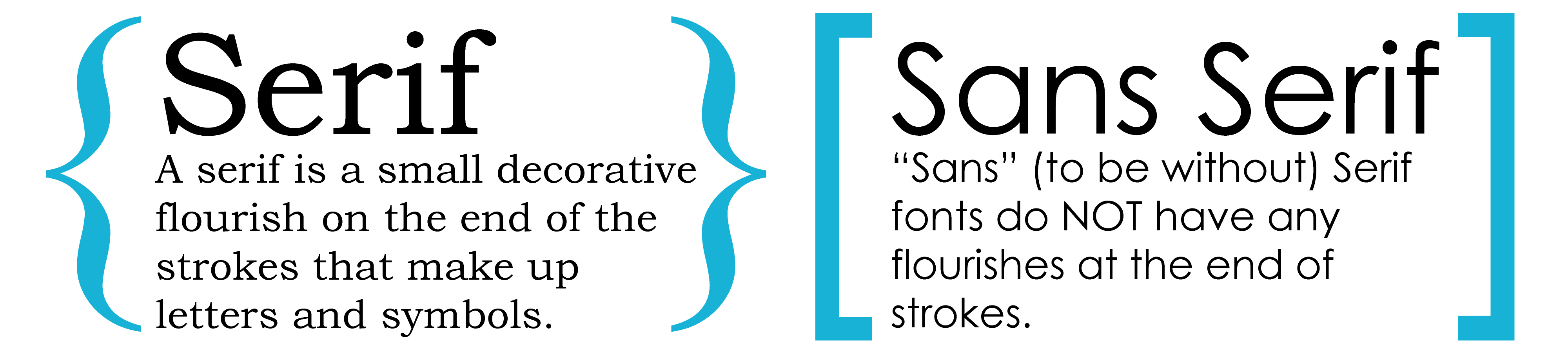
FONT: You may know the oldie (but goodie) Helevetica as a dear friend, but trust me (!) there is a whole other dimension of amazing and inspiring fonts. Typography in graphic design is a huge trend that can amp up a stale design.
• Combine Fonts: Mix and Match fonts to add interest and keep your viewer's eyes locked on the page. Try mixing serif and san serif fonts. As a good rule of thumb, they work great together.
• Play with Size: Make your headline stand out and use supporting text in subtle ways. Let your viewer know what is most important. Think about what you want to SHOUT off the page? Now make that bit of text large and visually interesting.
• Context: Comic Sans may be your favorite go-to font when you are feeling funky, but best left off your legal letterhead. Context is key. Making labels for your newest BBQ sauce? Get saucy! Choose a font that has character, excitement, and inspires your viewer.
• Don't Panic: There are plenty of great FREE fonts sites at your disposal. Some personal favorites are:
http://www.dafont.com,
http://www.1001freefonts.com, or
http://www.urbanfonts.com/free-fonts. Use and abuse them!
COLOR: The color you see on your screen can be radically different from printed materials. It is critical you design for color printing in order to get the best results.
• "Four Color" / CYMK jobs must be designed in CMYK. Text should be 100% K, backgrounds and shape fills should be rich black (40% C, 30% M, 30% Y, 1005 K).
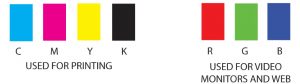
• Spot Color / Pantone color jobs should be color separable vector files. Don't forget to indicate what Pantone color you would like!
RESOLUTION: Put your best foot forward- send high resolution art file to your printer! To ensure a high quality finish, image resolution should be 300 dpi or higher. Anything less and you risk the file not printing clear enough.
Not sure if your art file will print well for a project? Send it to us! We are happy to take a look and advise if there is anything that can be done to produce the best printed pieces.