Most businesses think they have a signage problem. What they actually have is a navigation problem. Signs are just the solution. Getting that distinction right changes everything about how you plan, budget, and execute a wayfinding project.
This guide covers the full picture: what wayfinding really is, how to design it properly, what materials to use where, what ADA actually requires, and how to know when your current system is costing you money.
No fluff. No theory for the sake of theory. Just what you need to know to get this right.
What Wayfinding Signage Is and Why Most Businesses Get It Wrong
Wayfinding signage is a system of signs that guides people through a physical space from arrival to destination. The keyword is system. One sign is not wayfinding. Twenty signs in different fonts, colors, and sizes, ordered over ten years from three different vendors, are not wayfinding either. That is just visual noise.
A real wayfinding system speaks the same visual language across every sign in every location. Visitors learn it once, trust it immediately, and do not need to ask anyone for directions.
Most businesses do not have a system. They have signs that have accumulated. That gap between what they have and what they need is exactly where money gets lost every single day.
What It Actually Costs Your Business When Wayfinding Fails
This is the part other guides skip. Bad wayfinding has a real dollar figure attached to it.
Every time a visitor stops a staff member to ask for directions, that employee loses focus for three to five minutes. In a 40-person office where this happens eight times a day, you are losing hours of productive work per week. That is payroll money spent on something a well-placed sign should be doing for free.
In a medical office, a patient who cannot find the right suite arrives late, disrupts the schedule, and requires a reschedule. That is lost appointment revenue plus a patient who leaves with a bad impression.
In a retail space, a shopper who cannot find what they are looking for does not always ask. They leave. Studies from the Society for Experiential Graphic Design show that facilities with professional wayfinding see up to 60 percent fewer directional interruptions from staff. That is not a design outcome. That is a business outcome.
There is also liability. Missing or incorrect regulatory signage in any commercial space exposes you to real legal risk. And there is brand perception. A space with faded, inconsistent, and confusing signs tells visitors something about the business before anyone opens their mouth.
Wayfinding is not a cost. It is infrastructure.
The Four Sign Types Every Complete System Needs
Directional Signs
These are the signs that point. They belong at every decision point, not at the destination. A decision point is any point where a visitor could go the wrong way. That is where the sign needs to be.
The most common mistake: placing directional signs at the destination rather than at the choice point. By then, the visitor has already turned the wrong way and is already confused.
In a medical building, directional signs need to start in the parking lot. A patient who gets lost before they enter the building arrives stressed. That sets the tone for the entire visit.
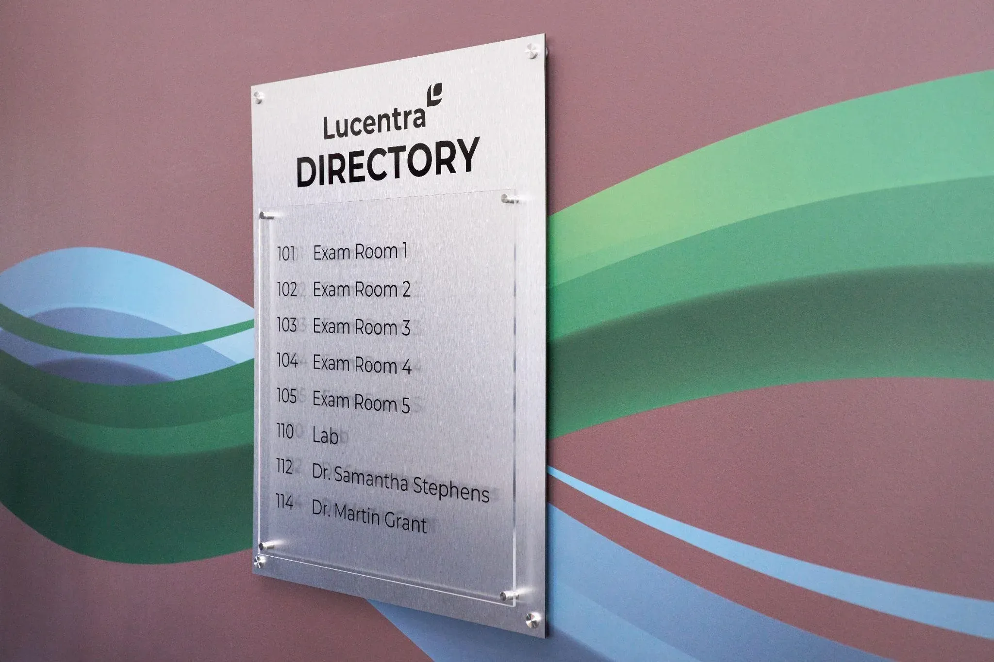
Informational Signs
Maps, directories, floor guides, and hours are posted at the entrance. These answer the question a visitor has right now, in this spot. The trap is overloading them.
A lobby map with forty labeled rooms is harder to use than one showing the eight destinations most visitors actually need. Write down every direction question your front desk takes in a week. Those answers belong on your informational signs.
Identification Signs
These confirm that someone has arrived. Room numbers, department names, floor labels. They sound simple, but they fail constantly. The sign is too small. It is hidden behind the door when it is open. A visitor has to be standing directly in front of the door before they can read it.
An identification sign should be readable from ten feet away. If it is not, it is in the wrong position or the wrong size.
Regulatory Signs
Exit signs, evacuation maps, ADA markers, no-smoking zones, elevator capacity. These are required by law in commercial spaces nationwide. They are not optional, and they cannot be designed around your branding preferences.
One thing most businesses forget: regulatory signs must be updated when your space changes. A renovation that moves walls or changes exit routes requires updated evacuation maps. Leaving old ones up after a renovation is not just confusing. It is a liability.
Indoor vs. Outdoor Wayfinding: Two Different Problems
Most guides treat this as one topic. It is not.
Outdoor signs face UV radiation, heat, humidity, freezing temperatures, and seasonal storms, depending on your region. Materials that look fine inside will warp, fade, or corrode outdoors within a year or two if they are not specified for exterior use. The finish matters as much as the substrate.
Outdoor wayfinding also serves people on the move. Signs visible at 20 miles per hour need larger text, shorter messages, and placement that accounts for sightlines from a car. Too much information on an outdoor sign means none of it gets read.
Indoor signs operate in a controlled environment, but lighting matters more than most people realize. A sign color that works in natural daylight may disappear under fluorescent lighting in a windowless hallway. Always test your material and color choices under actual conditions before you approve full production.
The connection point between outdoor and indoor wayfinding is usually the main entrance or lobby. This handoff location is one of the most important in the entire system. A visitor who successfully follows outdoor signs to the right entrance should immediately see indoor signs continuing the journey. Gaps in this handoff are among the most common failures in wayfinding systems.
ADA Compliance: What the Law Requires That Most Businesses Miss
The ADA has specific technical requirements for commercial signage. Getting them wrong creates liability that shows up during audits or complaints, often long after the signs were installed.
Here is what is most often missed.
Permanent room identification signs must be mounted on the latch side of the door. Not above the door. Not centered on the door. On the latch side, with the centerline of the sign at 60 inches from the floor.
Grade 2 Braille is required on permanent room identification signs. It must be positioned directly below the corresponding raised text. Not beside it. The bottom of the Braille cells must be between 40 and 60 inches from the floor.
Signs must have a non-glare finish. A glossy surface that creates reflections fails the standard regardless of the strength of the color contrast.
Text and background contrast must be at least 70 percent. This is measurable. Approximate is not enough.
Characters must be at least 5/8 inch tall for most room signs. Fonts must be sans-serif with consistent stroke width. Decorative, script, or condensed fonts do not meet the legibility requirement.
When a pictogram identifies a room, it must be accompanied by a verbal descriptor in raised characters and Grade 2 Braille below the pictogram field.
These requirements apply specifically to permanent room identification signs. Directional and informational signs have different, somewhat less restrictive requirements. Working with a sign company that fully understands the standard is the safest approach.
Materials: What Works Where and What Fails Early
Aluminum is the right choice for most exterior directional and building identification signs. It is corrosion-resistant, holds powder-coat finishes well, and handles heat without warping. Powder-coated aluminum outlasts painted aluminum outdoors by years.
Acrylic is the standard for interior identification signs. Sharp appearance, holds color well, cleans easily with commercial products. Do not put it outdoors. UV exposure makes acrylic brittle over time.
PVC and foam board are appropriate only for temporary signs or short-term installations. They do not hold up to repeated cleaning or long-term handling. If your permanent wayfinding signs are on foam board, plan to replace them within two to three years.
Dimensional letters made from metal, acrylic, or high-density foam are the right choice for lobby identification, building names, and reception environments. They create depth, read from a distance, and signal a level of professionalism that flat signs cannot match. They cost more. In high-visibility locations, they are worth every dollar.
Vinyl graphics on walls, windows, and floors are among the most flexible and cost-effective tools in wayfinding. Floor decals at decision points and wall-mounted directional graphics are both common and effective. High-quality cast vinyl lasts three to seven years indoors, depending on traffic and cleaning frequency. Professional installation is not optional. Bubbles and peeling edges undermine everything the sign is trying to communicate.
Digital screens and interactive kiosks belong in large, complex environments where destinations change frequently and an interactive directory adds real value. For most small and mid-size businesses, a well-designed static sign system is more reliable, less expensive to operate, and completely adequate. Digital works best as a layer on top of a strong physical system, not a replacement for one.
How to Design a Wayfinding System: The Real Process
Walk the Space as You Have Never Been There
Have someone unfamiliar with your building walk in through every entrance visitors use. Ask them to find the restrooms, the main office, the elevator, and an emergency exit without any help. Watch where they hesitate. Watch where they go wrong. Every moment of confusion is a sign of missing or failing.
If you are the owner or facilities manager, you cannot do this honestly. You know the building. You need someone who does not.
Map the Visitor Journeys That Actually Happen
Who comes to your building, and where are they trying to go? A first-time patient in a medical office takes a different path than a delivery driver or a returning client. Map the three to five most common visitor journeys. Those are the paths that need the most signage, because those are the paths where confusion costs you the most.
Lock In Your Design Language Before Anything Gets Made
One or two fonts, maximum. Both must be legible at a distance. Sans-serif typefaces work. Script and display fonts do not.
Choose colors that meet ADA contrast requirements and test them in actual lighting conditions, not on a computer screen.
If you use icons, use them consistently across every sign in the system. ISO 7001 standard pictograms are recognized instantly by most visitors and reduce language barriers.
Standardize sign sizes and shapes. Visitors who learn to read one sign type can read all of them. Variation should be intentional, not random.
Put these decisions in writing before production begins. That document prevents the most common long-term wayfinding problem: signs ordered at different times from different vendors, with nobody checking that they still match.
Create a Sign Schedule
A sign schedule is a numbered inventory of every sign in the system, including its location, message content, dimensions, and mounting requirements. Every professional wayfinding project uses one. If a company you are talking to does not, they are not treating this as a system.
Test Before You Order Everything
Make samples of your most critical sign types. Put them in the actual locations where they will live. Have an unfamiliar person try to navigate using only those prototype signs. Find out what does not work before you have paid for a full production run.
Install Professionally
A well-designed sign hung at the wrong height or on the wrong side of a door frame fails on two counts: it looks wrong, and it may not meet ADA requirements. Professional installation ensures every sign is where it needs to be, at the right height, plumb and level, correctly positioned for the person using it.
Review After Installation
Watch how real visitors use the system after it goes up. Are there still spots where people stop and look confused? Those spots need attention. Post-installation observation is the only honest test of whether a wayfinding system is working.
Signs Your Current System Is Failing
Your staff gives directions to the same locations multiple times a day. If a sign should answer that question and it does not, the sign is failing.
Visitors regularly arrive late because they cannot find the correct entrance or suite. This is a pattern, not an accident.
You have more than 2 or 3 fonts on your signs. That is not a design choice. That is evidence of signs ordered piecemeal over the years.
Some of your signs are faded, peeling, or damaged. Degraded signs communicate less and reflect poorly on whoever runs the space.
Your building layout has changed, and your signs have not been updated to match.
You received a comment about signage from a visitor, an inspector, or during any kind of compliance review.
One of these is a prompt to evaluate. When several of them are together, the system needs attention now.
What to Ask Before You Hire a Sign Company
Have you designed and installed complete wayfinding systems, or do you primarily do production? Production only means they hand you finished signs and step back. Full service means they are accountable for the whole project.
Do you use a sign schedule? The answer tells you immediately whether they approach this as a system.
How do you handle ADA compliance? Ask for specifics. Vague reassurance is not enough.
Can I see examples of complete systems you have installed, not just individual signs?
What are your lead times, and how do change orders work? Know this before anything starts.
A Checklist to Run Before Any Wayfinding Project Starts
Before you call anyone, be honest with yourself about these questions.
Have you walked your space as a stranger and documented every point of confusion?
Do you know which visitor journeys happen most often in your building?
Do you have clear brand standards, colors, fonts, and logo guidelines that the sign system should follow?
Do you know whether you need a full replacement or a targeted update?
Have you set a budget that includes design, production, and professional installation?
Do you know who will own this project internally, from start to finish?
Businesses that answer these questions before starting get better results and spend less money fixing mistakes.
Industry-Specific Notes for Business Owners
Medical and healthcare offices. Wayfinding needs to start in the parking lot. Patients arrive anxious. Every moment of confusion before they reach a staff member worsens it. Color-coding by department works in larger facilities, but only when applied consistently throughout and introduced at the entrance through a map or directory. Design for mobility limitations, visual impairments, and cognitive challenges because that population is overrepresented in your visitor base.
Corporate offices and professional services. The visitor experience runs from the parking lot to the reception desk. That entire journey should require zero guesswork. After reception, meeting rooms are the primary destination for most first-time visitors. Lobby identification with dimensional letters and quality materials communicates professionalism before anyone speaks.
Retail and commercial spaces. Wayfinding is tied directly to completed transactions. A shopper who cannot find a department leaves or interrupts the staff. Department identification, aisle markers, and clearly signed checkout areas reduce both outcomes.
Industrial and manufacturing facilities. Visitors, auditors, vendors, and inspectors need to reach the office without walking through production areas. Clear visitor signage from the parking through to the reception is essential. ADA compliance still applies to any area that receives members of the public, even if most of the facility is a production floor.
Ready to Fix Your Wayfinding?
AlphaGraphics Conroe handles the full process: design, sign schedule development, production, and professional installation. We work with medical offices, corporate campuses, retail spaces, and industrial facilities of all sizes.
We produce ADA-compliant room and identification signage, complete directional sign systems, building and exterior signs, large-format prints, vehicle graphics, wall and window graphics, and dimensional letter installations.
If your space is costing staff time, confusing visitors, or showing its age with inconsistent signage, call us and let us look at it together.
Phone: (936) 756-3738
Address: 3031 N. Frazier, Conroe, TX 77303