A menu board is the most expensive square footage in your restaurant. Not in dollars per square foot to make, but in revenue per square foot to influence. Every customer who walks in or pulls up to your drive-through reads it, processes it, and makes a buying decision based on what they see. A great menu board sells. A bad one quietly costs you money every single day.
We make menu boards for restaurants throughout the Brentwood, Franklin, and greater Nashville area. Fast food, fast casual, sit-down, coffee shops, food trucks, breweries, ghost kitchens. Different operations need radically different menu solutions, and the design choices matter more than most owners realize. This guide walks through how to actually think about menu board design, with the production knowledge most generic blog posts skip.
If you want to skip ahead to our menu board service page, we can get into pricing and timelines specific to your concept. Otherwise, keep reading.
Start with the Type of Restaurant You Run
The biggest mistake we see is restaurant owners pulling design inspiration from a place that operates nothing like their own. A craft cocktail bar borrowing layout ideas from McDonald's. A quick-service taco place trying to look like an artisan French bakery. The customer experience drives design choices, and it varies widely across restaurant categories.
There are three menu board categories that matter, and they need different things.
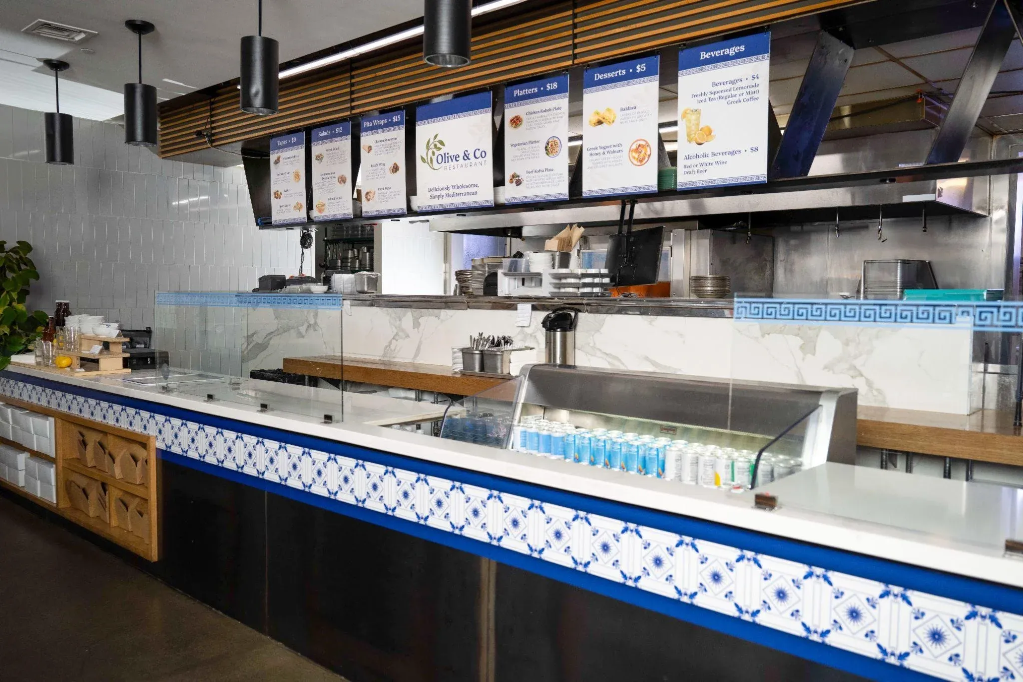
Fast food and quick service restaurants. Your customer is reading the board while standing in line or sitting in their car at a drive-through. They have 30 to 90 seconds to decide before it's their turn at the register. Speed and clarity beat everything else. Categories should be visible from across the parking lot. Combos and meal deals should anchor the visual hierarchy because that's where most of your margin lives.
Fast casual. The customer is ordering at the counter, but the line moves slowly, and they have time to actually read. You can introduce more detail, photos, ingredient highlights, and brand storytelling. Still has to be readable from the back of the line, but doesn't need to scream from 50 feet.
Full-service sit-down restaurants. The "menu board" question gets weird here because most sit-down restaurants don't have one. They have a host stand sign with hours, a chalkboard with specials, and printed menus at the table. The board, if there is one, exists to set tone and showcase rotating items.
Each of these categories requires different visual rules, production methods, and update systems. Mixing them creates menus that confuse customers and underperform.
The 20-Foot Rule (and Why Font Size Math Matters)
This is the single most useful technical concept in menu board design, and almost no one talks about it. The rule is simple. Your menu board text needs to be readable from the maximum distance a customer will be standing or sitting when they need to read it. For a drive-through, that might be 25 feet. For an ordering counter, 12 to 15 feet. For a takeout counter, 6 to 10 feet.
The general guideline: 1 inch of letter height for every 10 feet of viewing distance for comfortable reading. For headlines or category names, double that. For pricing, the standard reading-distance rule applies.
In practice, this means:
-
Drive-through menu boards typically need category headers 4 to 6 inches tall, item names around 2 to 3 inches tall, and prices clearly readable at 2 inches or more.
-
Counter-order boards can run smaller, but category headers should still be 3 to 4 inches and item names at least 1.5 to 2 inches.
-
Above-counter menus in coffee shops and casual cafes can sometimes go smaller because customers are closer, but only as small as the smallest customer eye-test in your space allows.
We have walked into restaurants where the entire menu was set at the same 1-inch font. From the back of the line, customers could read absolutely nothing. The restaurant was watching customers approach the counter, still trying to figure out what to order, which slowed down service for everyone behind them. A menu board reprint fixed it in a week.
Menu Engineering: The Layout Decision That Actually Drives Sales
Most restaurants treat their menu boards like lists. They put everything on it in alphabetical or category order and call it done. This is the easiest design choice and almost always the wrong one.
Menu engineering is a real discipline. It involves reviewing every item on your menu and categorizing it by two metrics: popularity and profitability. From there, you place items on the board based on where the eye actually goes.
The customer's eye tracks predictably across a menu board. In most layouts, the upper-right or upper-center area gets the most attention first. The bottom corners get the least. Items in the visual sweet spots sell more than items in dead zones, regardless of what they actually are.
What this means in practice:
Your highest-margin items belong in the visual prime real estate. Not your most popular items. The high-margin ones. The combo meal where you make 70 percent margin should be where the eye lands first, not buried at the bottom in 8-point text.
Items you want to push (specials, new items, high-margin combos) belong in visually distinct boxes or callouts. The eye tracks to contrast and isolation. A boxed combo with a small photo will outperform the same combo listed as text in a paragraph.
Categories matter. Customers decide what category they want before deciding on an item. If you sell mostly drinks but lead the board with food, you are working against your traffic pattern. Drinks should lead.
Decoy items work. A premium item priced significantly higher than your bestsellers makes the bestsellers feel like deals. This is the psychology that fast-food chains have used for decades.
We can help with the graphic design side of menu board layout if you don't already have a designer. Most of our restaurant clients use our in-house design team because they want the design and the production handled by the same people.
Menu Board Materials and What Each Actually Works For
The material decision matters more than most owners think. It affects how the board looks, how long it lasts, how you update it, and whether it survives a Tennessee summer if it's outdoors.
Acrylic. Smooth, modern, durable. Comes in clear, frosted, and any color you want. Holds up well indoors for years. Great for printed menu boards in fast casual and sit-down spaces. Easy to clean. Slightly more expensive than other options. We make a lot of these as part of our acrylic signs work.
Aluminum and dibond. Sturdy, weather-resistant, lightweight. Best for outdoor menu boards, food trucks, and drive-through panels. UV-stable printing means colors hold up against direct sun for years. The aluminum signs we make for restaurant clients usually use dibond for its longevity and flat printing surface.
Vinyl. Cost-effective for menus that change frequently. Can be printed as a single large panel or applied directly to a wall surface. Best for promotional menus, seasonal items, or temporary signage. Vinyl printing is the most flexible option for restaurants that update their menu monthly or seasonally.
Coroplast (corrugated plastic). Lightweight, inexpensive, great for short-term outdoor use. We use it for grand opening menu boards, food festival displays, and pop-up restaurant signage. Not the long-term solution, but the right answer for temporary needs. Our coroplast signs get a lot of use in the restaurant pop-up scene.
Chalkboard and write-on surfaces. The aesthetic choice for cafes, breweries, coffee shops, and any concept that wants to feel hand-crafted. Real chalk on real chalkboard has charm that no print can replicate. The downside is that the chalk has to be written by someone with actual lettering skill, or the result looks like a kid's homework. Many restaurants now use printed chalk-look boards that get the aesthetic without the labor.
Magnetic and interchangeable panel systems. A growing favorite for restaurants that change menu items frequently. Print individual item panels or price strips that swap out without replacing the entire board. The upfront cost is higher, but the ongoing update cost is dramatically lower. Worth it for any restaurant changing menu items more than quarterly. We make these as part of our magnetic graphics and modular sign work.
Digital menu boards. Screens displaying scheduled or rotating content. Industry data suggests digital boards draw significantly more attention than static. The trade-offs are real, though: higher upfront cost, ongoing electricity costs, content management software to learn, and screens that can fail in ways printed signs never do. We don't currently sell the screens themselves, but we design content for digital menu systems and pair them with printed signage in hybrid setups.
Fast Food Menu Boards: Specific Considerations
Fast food and QSR menu boards operate by their own rules because the customer behavior is fundamentally different.
The drive-through visibility test. Your menu board has to be readable through a car windshield, often in direct sunlight or rain, while the customer is partly distracted by traffic and trying to read it quickly. Outdoor menu boards need higher-contrast text, larger fonts than indoor boards, and weather-protected surfaces. The print method matters: UV-cured inks on aluminum or dibond hold up. Cheap vinyl in direct Tennessee sun fades in a year.
Combo positioning. Fast food makes the bulk of its margin on combo meals and beverage attachments. Combos should anchor the visual hierarchy, not the individual items. The customer should see "Meal #3" before they see "Cheeseburger" alone, because the meal includes higher-margin fries and a drink.
The right number of items. Counter-intuitively, more items reduce sales. Customers facing too many options often default to the safest, cheapest choice or freeze entirely. Most successful fast-food menus have between 12 and 25 items visible at decision time. Beyond that, decision fatigue sets in.
Price transparency or hidden pricing. Higher-end QSRs sometimes hide prices to avoid customers anchoring on cost first. Lower-end QSRs always show prices because their customers are price-sensitive and need to budget. Know which side of that line you're on before deciding.
Calorie disclosure compliance. Federal law requires chain restaurants with 20 or more locations to display calorie counts for all standard menu items on menu boards and printed menus. If you operate a single location, this doesn't apply to you. If you're part of a chain or growing one, this is a real design constraint. The calorie counts have to be next to each item, same font as the price, and same prominence. Plan the layout around it.
Sit-Down Restaurant Menu Boards
Sit-down restaurants rarely use menu boards the way QSRs do, but signage still matters.
The host stand sign. Sets first impression. Should match your brand identity, include hours, and welcome guests. We make a lot of these as part of building signage and wayfinding signage packages.
Specials boards. Often chalkboard or write-on surfaces because the content changes nightly. Worth investing in good lettering or a printed-look board if no one on your staff has the handwriting for chalk.
Bar menus and wine boards. Often the most photographed signs in a restaurant because they're behind the bar at the most visible spot in the room. Worth treating as a real design exercise, not an afterthought. Mounted printed panels, framed prints, or branded chalkboards all work depending on your concept.
Floor and table-talker signage. Less menu, more sales tool. Promotes happy hour, specials, or seasonal items at the point of decision. We do a lot of these as floor decals and retail signs for restaurant clients.
Common Design Mistakes That Hurt Sales
A few things we see over and over that quietly cost restaurants money.
The menu is one big paragraph. Categories are unclear, items run together, and the customer's eye has nowhere to land. This is the single most common mistake.
Too many fonts. Mixing four different typefaces makes the board feel chaotic and amateur. Two fonts maximum. One for headers, one for body text.
Pricing in tiny text. If the price requires squinting, the customer assumes it's high. They are usually right. If your prices are competitive, show them clearly. Hiding prices signals embarrassment about cost.
Photos that look like stock photos. A bad photo is worse than no photo. If you can't afford good food photography, skip the photos and rely on strong typography and descriptions instead.
Inconsistent branding. The menu board doesn't match the rest of the restaurant. Colors, fonts, and tone should all feel like the same brand the customer sees outside, inside, and on their receipt.
Forgetting about updates. The original menu was beautiful three years ago. Now it has handwritten "discontinued" notes taped over half the items and a Post-it noting the new burger price. If you change items frequently, design the board for change.
What to Expect When You Order a Menu Board
A few production realities most owners don't think about until they're in the middle of it.
Design lead time. If we're designing the board from scratch, expect 1 to 2 weeks for design rounds before anything gets printed. If you provide print-ready artwork, we can move much faster.
Production lead time. Standard menu board printing on acrylic, aluminum, or vinyl typically runs 5 to 10 business days depending on size and material. Complex multi-panel installations can take 2 to 3 weeks.
Installation. Mounting matters more than people realize. A heavy printed board attached to the wrong wall material can fail badly. We handle installation for most large menu board projects in the Brentwood and Nashville area. For DIY mounting, we provide hardware recommendations based on your specific wall type.
Lighting. Menu boards need proper lighting to be read at all times of day. Overhead spots, backlit panels, or backlit graphics can transform a board that disappears in low light into one that pops.
Updates. Plan for them. Pick a system that lets you update prices and items without reprinting the entire board. Magnetic panel systems, interchangeable strip menus, and digital displays all solve this problem differently.
Frequently Asked Questions
What is the standard size for a restaurant menu board?
There is no single standard. Counter menu boards typically range from 36 inches to 8 feet wide depending on counter width. Drive-through menu boards are usually 4 to 6 feet tall and 3 to 5 feet wide. We size every board to the specific space and viewing distance.
How long does it take to make a custom menu board?
Most printed menu boards take 7 to 14 business days from design approval to delivery. Complex multi-panel systems or boards requiring custom fabrication can take 2 to 3 weeks. Rush production is available when timelines are tight.
What is the best material for a menu board?
For indoor permanent menus, acrylic or aluminum dibond are the most durable. For outdoor or drive-through use, dibond holds up best in Tennessee weather. For menus that change frequently, magnetic systems or printed vinyl are more flexible. Chalkboard works well for cafes and casual concepts.
How much does a custom menu board cost?
Pricing varies widely by size, material, and complexity. Basic single-panel menu boards typically start around $200 to $500. Multi-panel boards with custom design and installation run $1,500 to $5,000+. Digital menu board systems with content design run at higher rates. Get a custom quote for your specific project.
Can I update my menu board without reprinting it?
Yes, with the right system. Magnetic panel systems, interchangeable item strips, and digital menu boards all allow updates without full reprints. We help restaurants pick the right system for how often their menu actually changes.
Do you handle menu board installation?
Yes. Our team installs menu boards throughout Brentwood, Franklin, Nashville, and surrounding cities. Installation is included in most quotes for boards over a certain size.
What is the best font size for a menu board?
A general rule is 1 inch of letter height per 10 feet of viewing distance. Category headers should be double that. So for a board read from 15 feet away, item text should be 1.5 to 2 inches, and headers should be 3 to 4 inches. The exact ratio depends on your customer's typical viewing distance and lighting conditions.
Do digital menu boards work better than printed ones?
Digital boards attract more attention and let you change content easily, but they cost significantly more upfront, require electricity and software management, and can fail in ways printed signs cannot. Many restaurants use both a digital board for specials and rotating content and printed boards for the permanent menu. The right answer depends on your budget, your update frequency, and your concept.
Can I get a menu board for my food truck?
Yes. Food truck menu boards have specific design constraints due to limited mounting space, weather exposure, and the need to be readable from a distance. We design food truck menus regularly and have specific material recommendations for that environment.
Get Started
If you're planning a new restaurant, refreshing an existing concept, or updating an outdated menu board, we can help. Our team has designed and produced menu boards for restaurants throughout the Brentwood and Nashville area for over 18 years.
The next step is a conversation about your concept, menu, update frequency, and timeline. Visit our menu board service page to learn more about what we offer, or get in touch directly.
AlphaGraphics Brentwood, 18 Cadillac Drive, Suite 300, Brentwood, TN 37027 (615) 263- 4444 Monday through Friday, 8 AM to 5 PM
We serve restaurants and food businesses throughout Middle Tennessee. Get a quote for your menu board project, or send us your files if you're ready to start production.