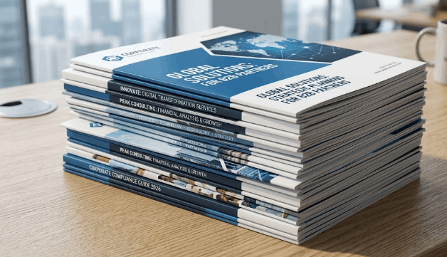
If you've ever held a brochure that felt cheap and flimsy, you already understand why paper weight matters. That thin, almost translucent sheet doesn't just feel wrong; it quietly signals to the person holding it that your business cuts corners. On the flip side, a brochure with the right weight and finish feels intentional. It says you take your brand seriously.
We get asked this question constantly at AlphaGraphics MIDDLETON: What paper weight should I use for my brochures? The honest answer is: it depends on what you're doing with them. A trade show handout has different demands than a direct mail piece, and a luxury leave-behind needs something entirely different from both.
This guide breaks it all down so you can walk in (or call us) knowing exactly what you need.
Key takeaway: There is no single "best" paper weight for brochures. The right choice comes down to your use case, your finish preference, and how much handling the piece will endure.
Understanding Paper Weight: What the Numbers Actually Mean
Paper weight is one of those things that sounds more complicated than it is. You'll see it expressed in a few different ways depending on who you're talking to.
-
lb (pound) weight: Common in the U.S. A standard office printer uses 20 lb bond paper. For brochures, you're typically looking at 60–100 lb text or heavier cardstock.
-
pt (point) thickness: Used for cardstock. 14 pt and 16 pt are the most common for mailers and premium brochures. Higher point = thicker, stiffer card.
-
gsm (grams per square meter): The metric standard. 130–170 gsm is a solid brochure range; 350+ gsm is premium cardstock territory.
The short version: the higher the number, the heavier and thicker the paper. But weight alone doesn't tell the whole story. A 100 lb gloss text feels very different from a 100 lb matte text, even though they're technically the same weight. Finish plays a major role in how professional your final piece looks and feels.
The Best Paper Weight by Use Case
This is where most guides fall short. They give you a generic recommendation without accounting for how your brochure will actually be used. Here's how we think about it.
Trade Show Handouts
At a trade show, your brochure is competing with dozens of others stuffed into a tote bag. It needs to be lightweight enough that people don't ditch it, but substantial enough to feel worth keeping.
Our recommendation: 80–100 lb text (130–170 gsm)
This range folds cleanly, stacks easily, and won't add bulk to a bag. It still feels noticeably better than copy paper, which matters when someone pulls it out later and decides whether to actually read it.
Direct Mail Brochures and Mailers
Mail goes through a lot before it reaches someone's hands. Postal sorting machines, bundling, weather exposure, and general handling can destroy a lightweight piece. You need something with structural integrity.
Our recommendation: 14 pt or 16 pt cardstock
These weights hold up through the full postal journey without bending, creasing, or tearing. 14 pt is the standard choice for most mailers; 16 pt is worth the upgrade if you want the piece to feel noticeably premium in the mailbox.
High-End Leave-Behinds and Sales Materials
This is your closing argument. A leave-behind that sits on a prospect's desk after a meeting needs to reinforce the quality of your brand every time they glance at it.
Our recommendation: 350+ gsm cardstock with a soft-touch or satin finish
At this weight, the brochure has real presence. Pair it with a soft-touch laminate and it becomes genuinely tactile, the kind of piece people pick up and notice. It's more expensive per unit, but for a targeted sales tool, the cost per impression is still very low.
General-Purpose Lobby and Rack Brochures
Brochures sitting in a display rack or reception area need to look sharp but don't need to survive the mail. A mid-weight option strikes the right balance.
Our recommendation: 80 lb text or 100 lb text with a gloss or matte coating
Gloss coating makes colors pop and gives a polished look. Matte is more sophisticated and easier to read under fluorescent lighting, which matters in waiting rooms and offices.
Quick Reference: Paper Weight Comparison Chart
|
Use Case
|
Recommended Weight
|
Finish Options
|
|
Trade show handouts
|
80–100 lb text (130–170 gsm)
|
Matte, gloss, satin
|
|
Direct mail / mailers
|
14 pt or 16 pt cardstock
|
Gloss, matte, UV coating
|
|
Premium leave-behinds
|
350+ gsm cardstock
|
Soft-touch, satin
|
|
Lobby / rack brochures
|
80–100 lb text
|
Matte, gloss
|
|
Basic informational handouts
|
60–80 lb text (20 lb bond)
|
Uncoated
|
Use this as your starting point. When in doubt, go heavier rather than lighter. The cost difference between a mid-weight and a premium stock is usually smaller than people expect, and the perceived quality difference is significant.
Finish Matters as Much as Weight
A lot of people pick their paper weight and then treat the finish as an afterthought. That's a mistake. The finish affects how your colors render, how the piece feels in hand, and whether it reads as polished or generic.
Here's how the most common finishes compare:
-
Gloss: High shine, vibrant color reproduction. Great for image-heavy brochures where photos need to pop. Can show fingerprints and glare under direct lighting.
-
Matte: Flat, sophisticated look. Easier to read, especially for text-heavy layouts. Colors appear slightly more muted, which can actually look more premium in the right context.
-
Satin: The middle ground. Better color saturation than matte, less glare than gloss. A strong default choice if you're unsure.
-
Soft-touch: A velvety laminate coating that makes the piece feel almost suede-like. Reserved for premium materials where the tactile experience is part of the brand statement.
Bottom line: If your brochure is image-forward, go gloss. If it's copy-heavy or positioned as a premium piece, lean matte or soft-touch.
Common Mistakes to Avoid Before You Print
We've seen these issues slow down or derail brochure projects more times than we can count. A little preparation goes a long way.
1. Sending RGB files instead of CMYK Screens display color in RGB. Printers use CMYK. If your file isn't converted before it comes to us, the colors you see on your monitor won't match what comes off the press. Always export in CMYK, or let our design team handle the conversion.
2. Missing bleed and margins Bleed is the extra artwork that extends beyond the edge of your final cut size, typically 0.125 inches on each side. Without it, you risk white edges on your finished piece. Keep important text and logos inside the safe margin zone so nothing gets trimmed.
3. Low-resolution images For print, you need images at 300 DPI at the intended print size. A photo that looks sharp on a screen at 72 DPI will print blurry. This is one of the most common issues we catch during file review.
4. No clear call-to-action This one isn't a print issue; it's a strategy issue. A beautiful brochure that doesn't tell the reader what to do next is a missed opportunity. Before you finalize your design, make sure your contact info, website, QR code, or next step is obvious and prominent.
If you're not sure whether your files are print-ready, that's exactly what our in-house design team is here for. We review files before production and flag anything that needs attention.
How We Handle Brochure Printing at AlphaGraphics MIDDLETON
We carry the full range of paper stocks described in this guide, from standard 20 lb bond up through 16 pt cardstock and 350+ gsm premium options. Everything is handled in-house, which means faster turnarounds, tighter quality control, and one point of contact from design through delivery.
A few things that set us apart for brochure projects:
-
No minimum order quantity for small-format printing. Order 25 brochures or 2,500. We don't require large minimums.
-
In-house design services if you need help building your layout or getting files print-ready.
-
Standard turnaround of 2–3 business days after artwork approval, with same-day and rush options available depending on current production volume.
-
Direct mail capability if your brochure project is part of a mailing campaign. We handle USPS prep and fulfillment completely in-house.
The fastest way to slow down a brochure project is artwork delays, so the sooner you can get us a file or brief, the sooner we can get you a proof.
Ready to get started? Contact our team at AlphaGraphics MIDDLETON to talk through your project, get a quote, or bring in your files for a free review.
Frequently Asked Questions
What paper weight is best for a tri-fold brochure?
For a standard tri-fold, 80–100 lb text (130–170 gsm) is the sweet spot. It folds cleanly without cracking and feels noticeably more substantial than copy paper. If you want a more premium feel, step up to 100 lb gloss or matte text with a coating.
What is the difference between text weight and cardstock?
Text weight paper is flexible and designed to fold. Cardstock (measured in points, like 14 pt or 16 pt) is rigid and does not fold well without scoring. For brochures that fold, use text weight. For flat mailers, rack cards, or leave-behinds that lay flat, cardstock is the better choice.
Do I need to provide print-ready files, or can your team help?
You do not need to come in with a finished file. Our in-house design team can build your layout from scratch, refine an existing design, or take your raw materials and make them print-ready. We review every file before it goes to press and flag anything that needs attention before production starts.
How long does brochure printing take?
Our standard turnaround is 2–3 business days after artwork approval. Same-day and rush options are available depending on current production volume. The most common cause of delays is artwork that needs extra preparation, so the sooner you can get us a file or brief, the faster we can move.
Is there a minimum order quantity for brochures?
No. We have no minimum order requirement for small-format printing. You can order 25 brochures or 2,500. This also makes it easy to reorder smaller quantities later without being locked into a large run.
What finish should I choose for my brochure?
It depends on your content and brand positioning. Gloss is best for image-heavy pieces where photo vibrancy matters. Matte works well for text-heavy layouts and reads as more sophisticated under office lighting. Satin is a solid all-around option. Soft-touch laminate is reserved for premium leave-behinds where the tactile experience is part of the impression you want to make.
Can you handle mailing and fulfillment for brochure campaigns?
Yes. We handle the full direct mail process in-house, including USPS preparation and fulfillment. If your brochure project is part of a mailing campaign, we can manage it end to end so you do not need to coordinate with a separate mail house.