Brand Strategy & Design
April 28, 2026
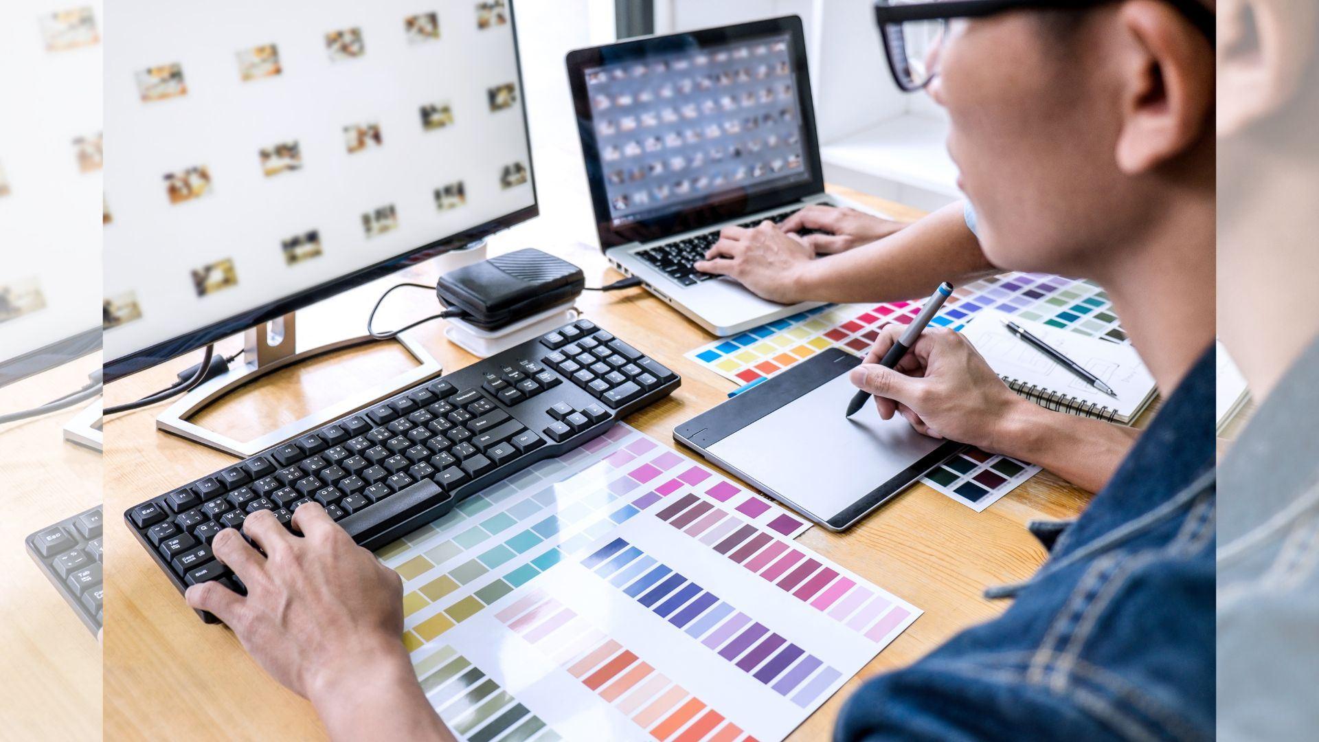
Ever handed out a flyer or posted a graphic that looked fine to you but somehow failed to grab attention or build trust with your audience?
A weak design rarely screams for attention, but it quietly chips away at your credibility. In this blog, we will explore the most common graphic design mistakes that can damage your brand image and how to avoid them with smart, professional choices.
When your colors, fonts, and logo placement change from one piece to another, it confuses your audience. A business card should feel connected to your signage, brochures, and social posts.
We see this often in local businesses using graphic design in Helena. Without a consistent style guide, designs start to feel disconnected and forgettable.
Stick to a defined set of brand elements:
Primary and secondary colors
Approved fonts
Logo variations for different uses
Clear spacing rules
Consistency helps customers recognize you instantly, whether they see your signage on a busy Helena street or your digital ad online.
Fancy fonts can look appealing, but they often reduce readability. If your audience struggles to read your message, they will move on quickly.
This becomes critical in applications like poster design in Helena, where viewers often scan information from a distance or while on the move.
We recommend:
Using no more than two to three fonts
Prioritizing legibility over decoration
Maintaining proper spacing and alignment
Readable typography ensures your message lands clearly and quickly.
Blurry images or pixelated logos immediately signal a lack of professionalism. Customers often associate poor visuals with poor service quality.
In outdoor environments, where weather conditions and lighting vary, high-resolution, durable print materials become even more important.
We focus on:
High-resolution image sourcing
Professional photo editing
Print-ready file preparation
For signage and large-format prints, we also consider material durability and weather resistance to maintain visual quality over time.
Trying to fit every detail into one design can overwhelm your audience. When everything stands out, nothing stands out.
Businesses often make this mistake in menus, flyers, and promotional banners.
Follow this simple structure:
Lead with one clear message
Support it with key details
Include a strong call to action
White space is not wasted space. It guides the viewer’s eye and improves overall clarity.
Design that works in one city may not connect in another. Local culture, environment, and audience preferences matter.
In graphic design in Helena, we consider factors such as outdoor use, seasonal changes, and community style preferences.
We design for:
Retail storefronts facing changing weather conditions
Event signage that needs visibility in busy public spaces
Vehicle graphics that must remain bold and readable on the road
By aligning design with local needs, your brand feels more relevant and relatable.
A beautiful design without direction is a missed opportunity. If people do not know what to do next, they will do nothing.
Every design should guide the viewer toward action, such as:
Visiting your store
Calling your business
Scanning a QR code
Clear direction turns attention into results.
Avoiding these common mistakes can transform how your audience sees your business. Clean layouts, readable fonts, high-quality visuals, and consistent branding all work together to build trust.
At AlphaGraphics Helena, we combine expert design support with high-quality production to help businesses stand out in competitive spaces. Our team understands local needs, material durability, and design best practices.
If your current visuals are not delivering results, now is the time to act. Partner with AlphaGraphics Helena to create designs that capture attention, communicate clearly, and strengthen your brand presence.