
Event & Promotional Signs
August 27, 2025
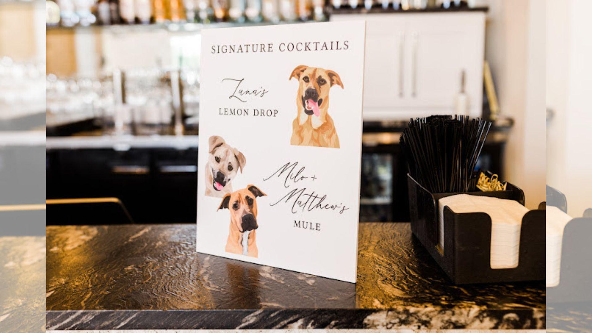
A professionally designed and printed draws eyes and gets your message across. Whether you're promoting a grand opening in downtown Raleigh, announcing a neighborhood event, or showcasing something new at the State Fairgrounds, print quality matters.
So, why do some posters stand out while others barely register?
It's not all about the design. A lot depends on the decisions you make before anything goes to print.
Here are seven practical tips for poster printing in Raleigh that will help you create a poster that looks sharp and lasts.
The paper you pick sets the tone. It influences how your colors show up, how the print feels in your hand, and how long it'll last once it's hung.
If the poster's staying indoors—say, in a coffee shop on Hillsborough Street—a heavier matte or satin paper
usually does the trick. For anything going outside (like on event boards around NC State or along Fayetteville Street), it's smart to use synthetic or UV-resistant stock that can handle the elements.
Glossy paper gives color an extra pop but can throw off glare under certain lighting. Matte finishes feel more refined and make your content easier to read—especially in places with bright overhead lights.
A sharp, high-resolution image is critical. Low-resolution images will blur or pixelate when printed large.
Always design your poster at 300 DPI (dots per inch) at full size.
Use vector graphics when possible. These scale without losing quality.
Save files in print-ready formats like PDF, TIFF, or EPS.
Also, include bleed in your file—typically 0.125 inches on all sides. This ensures that the poster is trimmed without white edges.
Colors look different on screen compared to print. That's why color calibration is key.
Design in CMYK color mode, not RGB. CMYK reflects how printers apply ink.
Use Pantone colors if you need precise brand consistency.
Request a printed proof to see how colors appear on actual paper before the final run.
This extra step can prevent surprises and keep your branding on point.
Lamination doesn't just make your poster look better; it protects it.
Gloss laminate enhances color and adds shine.
Matte laminate gives a soft, professional look.
Both types help prevent moisture, tearing, and scratches.
Especially if your poster will be displayed in high-traffic areas, lamination can make a big difference.
Text should be easy to read from a distance. Many posters fail because the message is too small or crowded.
Use bold, legible fonts.
Stick to 2-3 typefaces maximum.
Avoid long blocks of text. Break it up with spacing and visuals.
Hierarchy matters too.
Your headline should grab attention first, followed by supporting details and a clear call to action.
You may have the perfect design, but the right printer can make or break your results.
Partnering with experts in poster printing in Raleigh ensures your vision comes to life with precision and quality.
Professional printers offer high-grade materials, advanced printing techniques, and quality checks that DIY printing can't match.
While posters are powerful, they're just one part of your visual branding. To stand out, consider expanding your presence with custom signage in Raleigh.
Custom signage can create a unified, professional image across all touchpoints, from window graphics to banners and directional signs.
Often, the little extras like custom signage in Raleigh help reinforce your brand and keep your message in mind.
Great posters don't happen by accident.
It takes the right materials, careful design choices, and expert printing to create something that looks polished and lasts longer.
Whether planning one poster or a whole campaign, these tips will help ensure that your poster printing in Raleigh makes a lasting impact.
AlphaGraphics Raleigh can help bring your posters to life with expert guidance, quality materials, and reliable printing.