Print Production & Setup
August 23, 2026
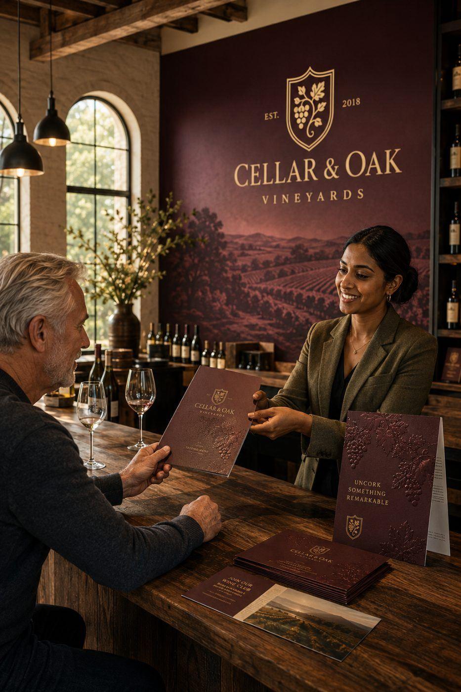
Yes — the finish tells people what you're worth before they read a word. Embellished pieces are 2.5x more attractive to consumers, and enhanced print is judged 46% higher quality than the same design run flat. People price you by how a piece feels in the hand.
Hand someone an embossed, gold-foiled tasting menu and you've told them the evening is worth the price before the first pour. Hand them a photocopy and you've said something else. That's perceived value — and it's the highest-leverage way to raise what a customer thinks you're worth, before you've proved a thing.
The research backs the instinct. In a Clemson eye-tracking study, a foil-stamped package from an unknown brand pulled more attention — and more purchase intent — than national brands with decades of recognition. That is the finding worth sitting with if you're a local business competing against a name people already know.
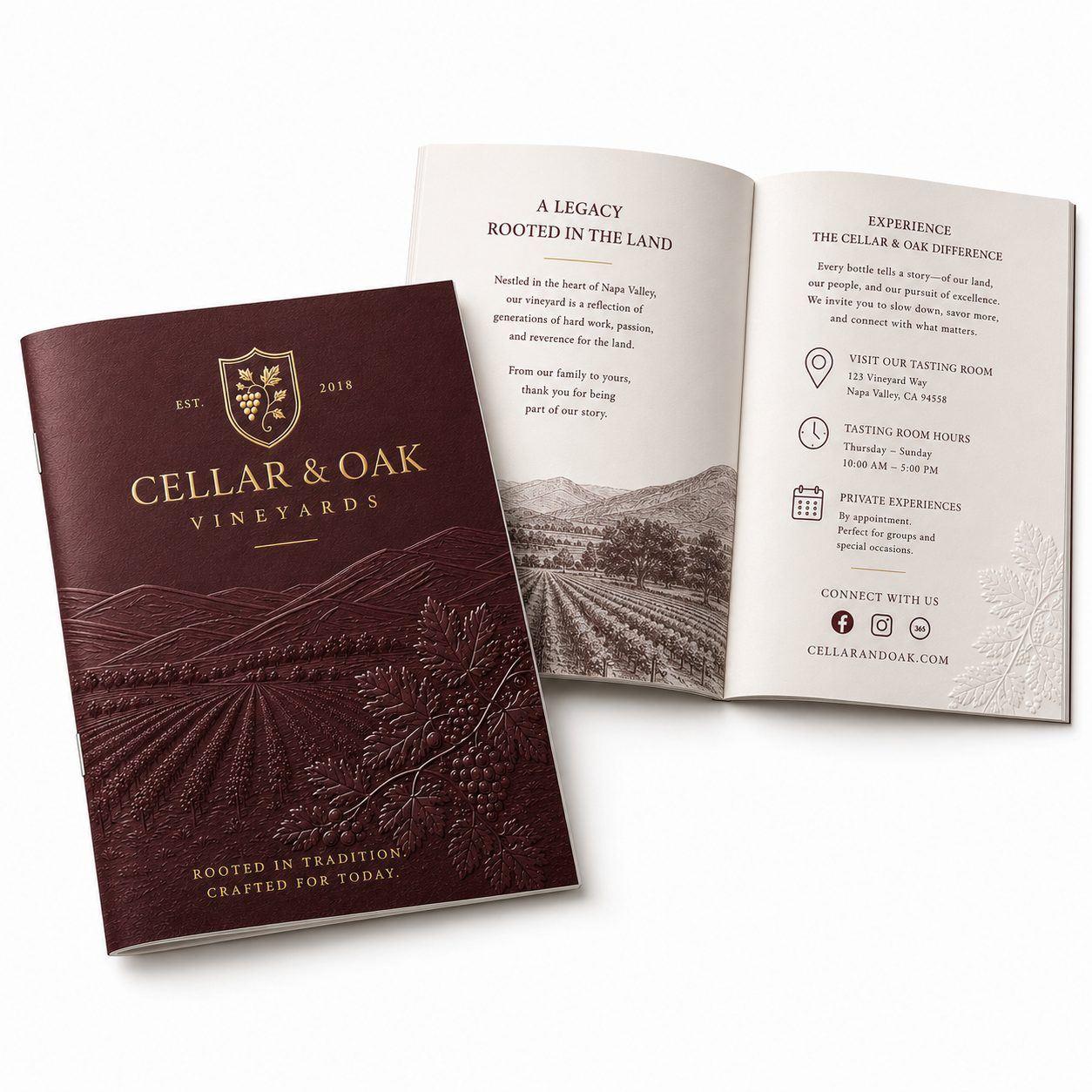
You can't judge these on a screen — each is a texture, and texture doesn't photograph. You have to hold it.
Soft-touch laminate. A velvet, almost suede feel the instant it's picked up — more luxurious than it cost, before a word is read.
Spot UV. Glossy varnish over matte, only where you want it. It hides straight-on and appears when the light catches it — rewarding a second look.
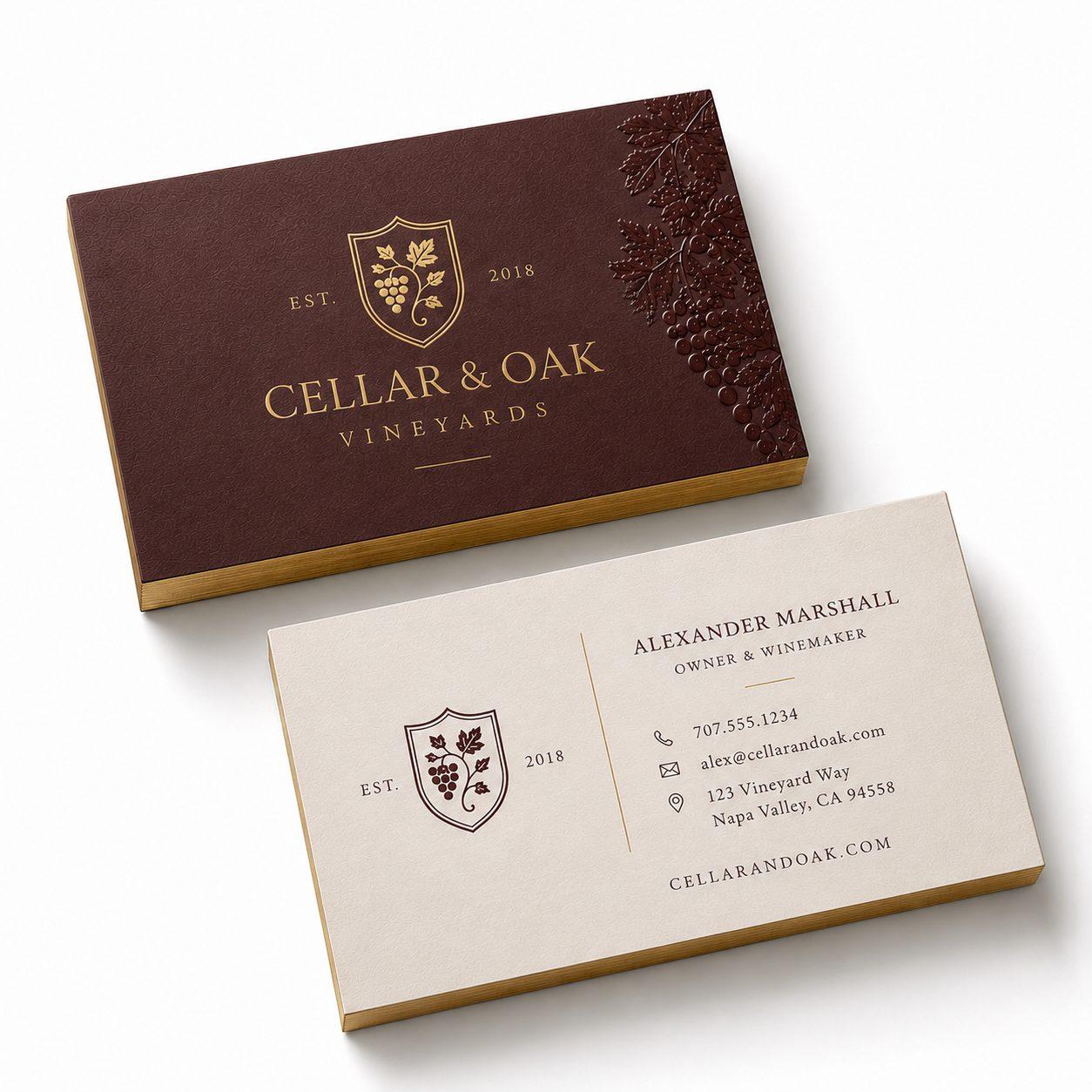
Foil stamping. Mirror-bright metallic that reads as premium across a table or from a wallet — why it survives on a card that lives in a pocket for years.
Sculpted emboss. The design pressed into the stock so a finger finds the relief. A screen can't do this at any resolution — which is exactly why it reads as craft.
Pair foil with emboss on a menu cover and the two compound. It's the standard move on wine lists and event stationery for that reason.
Before you choose an effect, choose a stock. Standard business cards and printed collateral run 14pt. At 16pt a card stops feeling like paper and starts feeling like an object — the largest perceptual jump available for the smallest money, and the one change we recommend most often.
The edge matters too, and almost nobody thinks about it. A clean cut, a painted edge, a rounded corner: the edge is what a thumb finds while you're still talking.
There's real neuroscience under it. In a Canada Post / TrueImpact study using EEG and eye-tracking, physical media took 21% less cognitive effort to process — and afterward 75% could name the brand from the physical piece, against 44% from the digital ad.
It shows in response, too: an embellished postcard pulled a 16.8% response rate, about 31% higher than the same card run flat. For a direct mail or EDDM campaign, that difference frequently outweighs the added unit cost of the finish, because the cost of a mail drop is dominated by postage and list rather than by paper.
Settle the message first, then let the finish raise the ceiling on it.
The paper elevates how a piece is received; the words decide whether someone acts. Get those in the right order and the finish does exactly what the research says — it makes a strong offer read as a premium one.
That is why the pieces worth embellishing are the ones that already work: the card you hand across a table, the proposal cover, the menu, the invitation. Put the money where the piece is already doing a job.
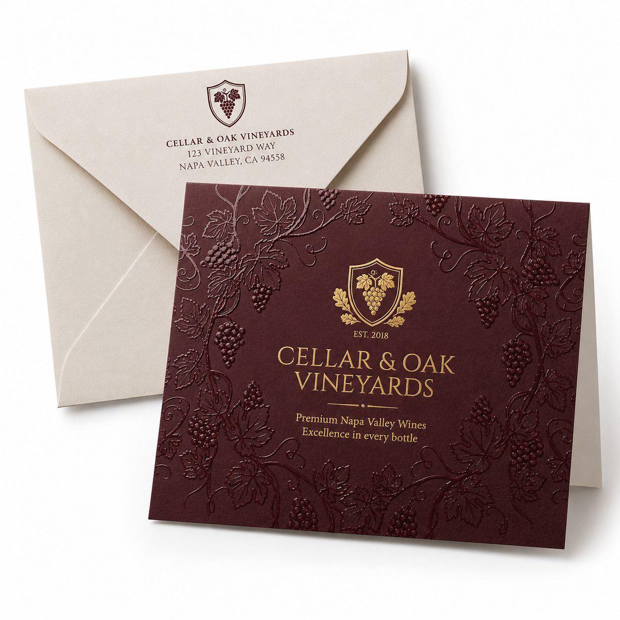
Spend the finish budget where the piece is held longest and judged hardest: the card that stays in a wallet, and the menus, brochures, and booklets a customer reads while deciding what to spend. A run of flyers destined for a windshield is not where foil pays for itself.
Spot UV is a glossy clear varnish applied only where you want it, so the effect appears when light catches it and hides when viewed straight on. Foil stamping presses a metallic film onto the sheet with heat and a die, producing a mirror-bright surface visible from across a table. Spot UV rewards a second look; foil gets noticed first.
Less than most owners assume. Soft-touch is a film laminate applied across the whole sheet rather than a per-element process like foil or emboss, so it adds a modest cost and changes how a card feels more than any color decision will. On business cards it is generally the highest perceived-value gain per dollar spent.
Standard cards run 14pt. At 16pt a card stops feeling like paper and starts feeling like an object, which is the largest perceptual jump for the smallest money. Doubled 32pt stock with a colored core showing at the edge reads as a gift rather than a card — worth it when the card is the entire first impression.
Yes, and the two compound. A combination die foils and raises the same artwork in one pass, which is the standard move on wine lists, event stationery, and premium menu covers. It is more expensive than either alone and worth reserving for one element, usually the logo or title.
Both, in the research available. Beyond perceived-quality gains, JICMail reported an embellished postcard pulling a 16.8% response rate — roughly 31% higher than the same card run flat. Canada Post's neuromarketing work found physical media took 21% less cognitive effort to process, with 75% of participants able to name the brand from the physical piece against 44% from a digital ad.
You largely can't, and that's the point — every one of these finishes is a texture, and texture doesn't photograph or render on a screen. Come hold printed samples in the light you'll actually see the piece in. Fifteen minutes with a swatch book prevents the most common expensive mistake, which is ordering a finish that reads differently in the hand than it did on the proof PDF.
The ones already doing a job in someone's hands: the business card you pass across a table, a proposal or presentation cover, a menu, an invitation, and packaging. Those get held, compared, and kept. Items that get skimmed once and recycled — internal forms, high-volume flyers, mailers with a short shelf life — rarely repay a finish.
Less than most people expect on a card-sized piece and more than expected on a large run, because most embellishments carry a setup charge that spreads across the quantity. Moving from 14pt to 16pt stock is the cheapest perceived-value jump available. Foil, emboss, and spot UV sit above that, and combining two on one piece costs less than running them as separate passes.
Usually, yes, but the artwork needs a separate layer telling the press exactly where the effect goes — the foil shapes, the emboss areas, the spot UV mask. If your file does not have one, it can be built from the existing design. Fine hairlines and very small type are the two elements that most often need adjusting before they will hold a finish cleanly.
Foil and emboss are physically part of the piece and outlast the paper around them. Soft-touch laminate is durable but shows fingerprints and scuffs on dark solids, which is worth knowing before choosing it for a card that lives in a pocket. Spot UV is hard-wearing and the most forgiving of handling.
AlphaGraphics San Antonio — Shavano Park serves Shavano Park, Castle Hills, Stone Oak, Helotes, Boerne, New Braunfels, and the surrounding communities from 16101 College Oak Drive. Call (210) 222-0580 or request a quote and we will get you an answer the same business day.