File Prep Instructions
When designing your own files for print, it is important to understand file requirements and standards to avoid production issues. The professional designers at
AlphaGraphics South Salt Lake are happy to help prepare your files for print if you need assistance. Follow these guidelines while getting started in the design process to ensure file accuracy.
Choose Your Software Wisely
First up, you need to consider which software application you’re going to use to prepare your print document. There are a number of choices available, and it’s really up to you which program floats your boat! We recommend using the industry-standard Adobe Creative Cloud Suite, which includes Adobe InDesign, Adobe Illustrator and Adobe Photoshop. Microsoft Publisher, CorelDRAW and QuarkXPress or any publication software other than Adobe is useful, but substandard. Preparing files for print using Adobe Creative Cloud is simply the best way. Check out this cool Adobe software
video.
Document Resolution
Document Resolution - or DPI (dots per inch) - is the term used to describe the number of dots, or pixels, per inch used to display an image or file. Higher resolution means that more pixels are used to create the image, resulting in a crisper, cleaner image. An image will print pixelated when its resolution is low, or the image is enlarged significantly resulting in loss of quality. As a general guideline, 300 dpi is a sufficient resolution for most printed materials.
Bleeds
After trimming, the bleed ensures that no unprinted edges occur in the final trimmed document. It is very difficult to print exactly to the edge of a sheet of paper/card, so to achieve this, it is necessary to print a slightly larger area than is needed and then trim the paper/card down to the required finished size. Add quarter of an inch (.25") to each dimension to allow for cutting. For example, a 4” X 6” postcard with full bleed, the image size should be submitted at 4.25” x 6.25”. .125" (1/8”) on each edge of the card will be trimmed off during the cutting process. This will leave you a 4” X 6” standard post card. Your type (text) should be .125" (1/8”) inside the cut box on each side.
Vector vs. Raster: Which Do I Use?
There are two types of digital graphics files – vector and raster. Vector images are made of hundreds of thousands of tiny lines and curves (or paths) to create an image. Raster images are composed of pixels. But how do you know what format is best for your next project?
Vector

Vector images, which are made of thin lines and curves known as paths, are rooted in mathematical theory. Vector graphics must be created in computer software that is designed to create this intricate wireframe-type image. Each image can be sized and scaled repeatedly and limitlessly without losing resolution or beginning to look fuzzy or pixelated.
You can identify a vector image by looking at its edges — a vector image will always appear smooth no matter how large you make it or how close you zoom in. Text is one of the most common types of vector image. No matter how much you increase a font’s size, for example, its look never changes.
Another advantage to using vector images is file-size efficiency. Because the files are only identified by mathematical descriptions and not individual pixels, files are often much smaller than those of the raster counterparts. Vector images, therefore, are often easy to transmit from one computer to another and over the Internet.
Adobe Illustrator is well known for industry-standard vector format creation. Vector images are the No. 1 option when designing or creating a logo or illustration. Because of the way images are created and saved, you will have more flexibility with making changes and be able to use your image at a variety of sizes. You may only need a web logo now, but imagine how great it would be to have that image ready to use on a banner or merchandise later without having to create it all over again?
Raster
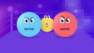
Raster images are often called bitmap images because they are made of millions of tiny squares, called pixels. You can identify a raster or bitmap image by looking at it very closely. If you zoom in enough, you will be able to see the square outlines of each pixel (especially around edges where there are dramatic color contrasts).
Photographs are not vector graphics. Only illustrations that are made to look like photographs can be created in a vector workspace. Raster images' dimensions are measured in pixels. Because raster images cannot be enlarged without losing quality, printers require that you provide them with files at the correct size:
1. The dimension you want to print your image at.
2. The pixel resolution for that particular project. The pixel resolution is the amount of pixels within each inch, called
dpi (dots per inch) or
ppi (pixels per inch).
CYMK vs RGB
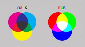
A lot of the colors you create in RGB (red, green, blue) mode are not achievable using standard four-color CMYK process printing. It is always best to create your document from the start in CMYK (cyan, magenta, yellow, black) color mode to ensure that you have a better idea of how your colors are going to print. Click image to enlarge.
Some exceptions are tradeshow signs or large format prints, but the best way to know for sure is to check with
AlphaGraphics South Salt Lake: 801-461-0500.
Four over Four (or 4/4)
If you’re printing a flyer, you might be printing 4/4, which essentially means you are printing four colors on the front (CMYK) and four colors on the back (CMYK). If nothing’s on the back, then it would be 4/0. For
postcards, you might print 4/1: four color on the front and 1 spot color on the back. For
business cards, you might print 2/2: 2 spot colors on the front and back.
Print Layout
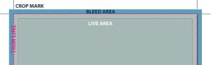
Here is a diagram of a typical document for print design. Click image to enlarge.
Trim Line: This is the finished size of the piece.
Live Area: The area that is considered safe to keep any important information within. For example, if an ad’s trim size is 8.25 in × 10.25 in, the live area might be 7.75 in × 9.75 in. This takes into consideration the binding if the ad is placed on the left or right of a spread and you don’t want copy to be unreadable if it is too close to the spine.
Bleed Area: The more bleed you can offer, the better.The minimum bleed you need for a printed piece is 0.125 in (1/8 in) but some specs require more than that. So if you are working with an image in Photoshop and you’re placing it in InDesign for print preparation, keep in mind the area you might need to use for the bleed.
Crop Marks: Indicates where to cut the paper.
Contact the AlphaGraphics South Salt Lake marketing team today for effective and successful product labeling. Call 801-461-0500 and talk to Gregg, Christian, or CJ.