In truth,
There is a lot more to printing than simple ink on paper. We often get requests on not only how to make a piece look good, but feel interesting as well. There are several ways to make your project feel different and be noticed.
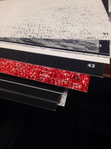
We are currently working on a book that uses two different textured papers to give a "gritty" feel. The cover is a Cranes Lettra, which is a handmade cotton paper. It feels rough (which is ironic since it is made of cotton, huh?) to the touch. The inside pages are on a felt text. This gives them a coarse feeling, but also makes the ink look perfectly aged. The combination of texture and ink help to tell the story of the book.
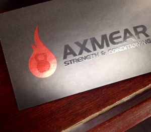
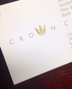
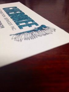
Texture on business cards can help tell the story of an individual or brand. Smooth, shiny UV coating gives a clean feeling. Embossing a logo or text adds an element of depth. Thermography, or raised ink, gives the card an engraved feeling. Foil is a fun option to add a pop of shine and color. It feels smooth, and is a great contrasting texture to a linen or felt stock.
[caption id="attachment_82" align="alignnone" width="300"]

UV Coating with Foil Stamping[/caption]
[caption id="attachment_81" align="alignnone" width="244"]

Foil Stamped Logo[/caption]
[caption id="attachment_79" align="alignnone" width="225"]

80# Felt Text Paper combined with specific machine settings provide this look and feel[/caption]
[caption id="attachment_80" align="alignnone" width="225"]

Embossed with ink registration[/caption]