Sometimes, it pays to be curious. While out strolling through the neighborhood (downtown Kansas City’s Crossroads Arts District) a couple of years ago, AlphaGraphics Kansas City’s
Allison Cade and
Haley Haar popped into
Tom’s Town Distilling Co. on a whim.
“They walked in one day before we were open—we were up on the third floor getting ready to launch,” says Kirsten McGannon, marketing director, Tom’s Town Distilling Co. “They walked in, introduced themselves, and invited us over to their office. It was the perfect time—we were just getting started, and I knew it would be a good idea to have a printer close to us.”
Tom’s Town is downtown Kansas City’s first legal distillery since Prohibition, a nod to an earlier era when the spirits flowed freely through the Paris of the Plains and “Boss” Tom Pendergast shrugged off Prohibition restrictions with a simple declaration: “The people are thirsty.”
Capturing that historic significance and aesthetic are integral parts of the Tom’s Town brand. McGannon says one of the big goals was to “recreate the Art Deco feel, because that’s what resonates with our target market: the glamorous, Gatsby feel. We wanted to recreate what Kansas City was like during the Pendergast era.”
A Salt Lake City-based designer created intricate, Art Deco-inspired visual branding, yet a challenge remained: bringing that branding to life.
“Our branding and design work incorporates a lot of fine lines and artwork, and we also wanted to use gold foil,” McGannon says. “It’s hard to print with gold foil—it has a tendency to stick and fill in the fine lines.”
After successfully collaborating on some smaller initial projects like business cards, the AlphaGraphics Kansas City team soon had an opportunity to work with McGannon on two key projects: menus and hang tags. The verdict? Success!
“They did a beautiful job,” McGannon says. “The foil work is stunning, and I think part of the reason is they helped us choose a paper that was hard, rather than absorbent, so the foil stamp pulled right up without leaving any residue on the paper.”
McGannon says the menus in particular were a big hit, thanks to a paper recommendation from AlphaGraphics Kansas City.
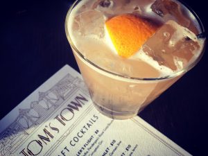
“They helped us choose this great paper stock: thick, textured and cotton-like,” McGannon says. “When people come to Tom’s Town and take a picture, the menu is what they take a picture of more than anything else, besides the mural on the side of the building.”
To further extend Tom’s Town’s immersive branding, McGannon says they opted to not encase the menus in plastic sleeves. This cuts down on how long a particular menu can be used, but she wants people to enjoy the resulting tactile experience.
“It was a home run—we’re still using these menus a year and a half later,” she says.
Tom’s Town staff and guests aren’t the only fans of how the menus and hang tags turned out. Both pieces recently won Awards of Excellence in PIA MidAmerica’s
2017 GraphEx Awards in two categories: menus and foil stamping (hang tags).
We’ll raise a glass to that!