So you're ordering business cards. Or brochures. Maybe a whole catalog. And somewhere in the process, you get a question asking you to pick between gloss and matte. Most people just freeze.
It feels like a tiny decision, but honestly? It changes everything about how your print job turns out. The wrong finish can make a gorgeous design look cheap, or make text nearly impossible to read under office lights. I've seen it happen more times than I can count.
Let me save you from that mistake.
What Are We Actually Talking About Here?
Both gloss and matte are coatings applied to paper after the ink goes down. Same base material, believe it or not. The difference is how much coating gets applied and what that does to the surface.
Gloss gets a thicker coat. That fills in all the tiny bumps and valleys in the paper, leaving you with a slick, shiny surface that bounces light right back at you. Colors look more intense. Photos look sharper. Everything has more pop.
Matte gets a thinner coat. The paper retains some of its natural texture, so light hits the surface and scatters in different directions rather than reflecting straight back. That kills the shine. Colors come out softer, more muted. But the text becomes way easier to read, and the whole thing feels more refined when you hold it.
A simple way to think about it: gloss is the loud friend who walks into a room, and everyone notices. Matte is the one who shows up in a great outfit, and you can't stop looking, but you're not sure why.
If You Just Want a Quick Answer
Look, not everyone has time to read a full breakdown. So here's the short version.
Pick gloss when your design is mostly photos or bold graphics, and you need it to catch someone's eye fast. Catalogs, photo prints, retail flyers, and menus with food photography.
Pick matte when your design is text-heavy, or you want a premium, polished feel. Business cards for professional services, corporate brochures, wedding invitations, and anything with a QR code.
That covers about 80% of situations. For the other 20%, keep reading.
What Gloss Does Well (and Where It Falls Short)
There's a reason gloss has been the default at most print shops for decades. It makes things look good. Period. Bright colors get brighter. Dark tones get deeper. Fine details in photographs become more visible because the smooth surface holds ink on top rather than letting it sink in.
Gloss also adds a thin protective layer. Your prints resist moisture a bit better and can handle light scuffing without showing damage. If your flyers are sitting in a rack by the front door of a busy store, that matters.
But gloss has real problems too.
Put a glossy brochure under fluorescent lights in a conference room and watch what happens. Glare. Everywhere. People tilt it back and forth trying to read your carefully written copy, and half the time they give up. I've watched this play out at trade shows, and it's painful.
Fingerprints are the other issue. Hand a glossy business card to five people at a networking event, and by the time the last person gets it, the thing looks like it went through a toddler's lunch. Every touch leaves a mark on that shiny surface.
And forget about writing on it. Pen ink smears on gloss. If your printed piece has a fill-in section, a response card, or even just a spot where someone might want to jot a phone number, gloss is the wrong call.
What Matte Does Well (and Where It Falls Short)
Matte is the finish that people underestimate. It doesn't have the immediate visual punch of gloss, but it wins on almost every practical level.
No glare. None. You can read a matte brochure under the harshest overhead lighting, and the text stays perfectly visible. This alone makes it the better pick for anything that's supposed to be read closely.
The feel is different, too. Matte paper has a subtle texture that feels more expensive in your hands. There's a reason luxury brands, high-end real estate firms, and upscale restaurants almost always go matte. It signals quality without screaming for attention.
Fingerprints? Barely visible. You can pass matte business cards around a room all day, and they still look clean. That's a bigger deal than most people realize.
You can also write on matte with a regular pen. Notes stick. Ink doesn't slide around or smear. For RSVP cards, appointment reminders, or any material where someone might need to write something down, this is a functional advantage you don't want to overlook.
Now the downside. Colors look less vibrant on matte than on gloss. If your design depends on saturated, punchy imagery to make its impact, matte will tone that down. It's not dramatic, but it's noticeable. A beach resort brochure full of turquoise water shots is going to lose some of that magic on matte paper.
Matte can also be slightly more prone to scuffing over time, though this depends largely on the specific paper stock and how the print is handled.
Which Finish Works Best for What You're Printing
This is where it gets practical. Different projects have different jobs to do, and the right finish depends on what job you're asking that print piece to handle.
Business Cards
This one gets debated constantly, and there's no single right answer because it depends on your industry and your brand personality.
If you're a lawyer, financial planner, architect, or consultant, matte almost always wins. It reads as serious and professional. It also works better with embossing and foil stamping if you want to add a special touch later. And clients can write on the back of your card when they need to.
If you're a photographer, graphic designer, florist, or event planner, gloss makes your work pop right there on the card. When your business is visual, you want a finish that shows off color and detail.
Brochures
Text-heavy brochures go matte. Nobody wants to fight glare while reading three paragraphs about your company's services under an office ceiling light.
Image-heavy brochures go gloss. Travel companies, interior designers, car dealerships, and food brands. When the photos need to sell, gloss sells harder.
Flyers and Postcards
Promotional flyers that need to stand out in a mailbox full of junk? Gloss. The shine and color pop give you an edge when you have about two seconds to grab someone's attention.
Personal cards, holiday mailers, event invitations, save-the-dates? Matte. It feels intentional, not mass-produced. And if there's an RSVP section, people can actually fill it out.
Posters
This depends entirely on where the poster will hang. A poster behind glass in a dim hallway? Gloss looks gorgeous. A poster under track lighting at a trade show booth or in a bright office lobby? Gloss will wash out from the glare. Matte handles those conditions without any issues.
Catalogs and Magazines
A smart move here is to use both. Gloss on the cover because that's your first impression, and it needs to grab attention. Matte or satin on the interior pages for comfortable reading. This is standard practice for a reason, and it works.
Something Most People Miss: QR Codes and Gloss Don't Mix Well
This is a newer consideration, but it matters a lot right now because QR codes are on everything. Menus, business cards, event materials, product packaging, and direct mail pieces.
Gloss surfaces reflect light. Phone cameras need a clear, non-reflective view to reliably scan a QR code. Under bright lighting, the glare on a glossy surface can completely prevent a QR code from scanning. I've seen people at events awkwardly angling a postcard trying to get their phone to read it, and half the time they just give up.
Matte finishes don't have this problem at all. The non-reflective surface gives the camera a clean shot every time, in any lighting.
If a QR code is part of your design and you actually need people to scan it, go with a matte finish. This isn't a style choice. It's a functionality choice.
You Can Actually Use Both (Spot UV)
A lot of people don't realize you're not locked into one or the other for the entire piece.
There's a technique called spot UV where your printer applies a full matte finish across the whole surface, then adds a glossy, slightly raised coating only on specific elements. Your logo. A headline. A key image. Whatever you want to draw attention to.
The contrast between the soft matte background and those shiny, tactile gloss accents looks incredible. It feels custom and high-end because, well, it is. You'll see this technique on premium business cards, luxury packaging, high-end invitations, and brand collateral from companies that take their print presence seriously.
It costs more than a standard single finish. But for materials that need to make a strong impression, the investment pays off.
Soft-Touch Matte Is Having a Moment
If you haven't felt soft-touch matte paper before, go find some and pick it up. It's different from regular matte.
Soft-touch (also called suede or velvet lamination) adds a velvety texture to the matte surface. It feels almost like touching a rose petal. People physically react to it when they pick up a card or brochure with this finish. They slow down and actually look at what they're holding.
Studies on retail packaging have consistently found that tactile finishes increase the time customers spend engaging with a product. Even a few extra seconds of attention can be the difference between someone reading your message or tossing it aside.
Soft-touch matte paired with spot UV gloss accents is probably the most impressive finish combination available in commercial printing right now. It gives you that premium feel throughout the piece, with strategic shine exactly where you want it.
A Word on Sustainability
More businesses are asking about eco-friendly printing options, and that's a good thing.
Water-based matte and gloss coatings are now widely available. They don't use plastic laminates, and they don't interfere with recycling. Matte tends to be marginally more recyclable due to its thinner coating layer, but modern aqueous gloss coatings are recyclable as well.
Ask your printer about their specific coating options. And if it matters to your brand (it probably should), look for FSC-certified paper stocks. You can absolutely achieve a beautiful, professional finish without compromising the environment.
How to Decide
Run through these five questions, and you'll have your answer in about thirty seconds.
-
What's the main content of the piece? Mostly photos or graphics point to gloss. Mostly text or minimalist design points to matte.
-
Where will people see or use it? Bright environments favor matte because there's no glare. Dimmer or controlled settings work fine with gloss.
-
Will people be handling it a lot? Lots of touching and passing around favors matte. Display-only pieces can go gloss.
-
Is there a QR code? If yes, strongly consider matte.
-
What feeling do you want to create? Bold and energetic leans gloss. Refined and sophisticated leans matte.
We Can Help You Decide in Person
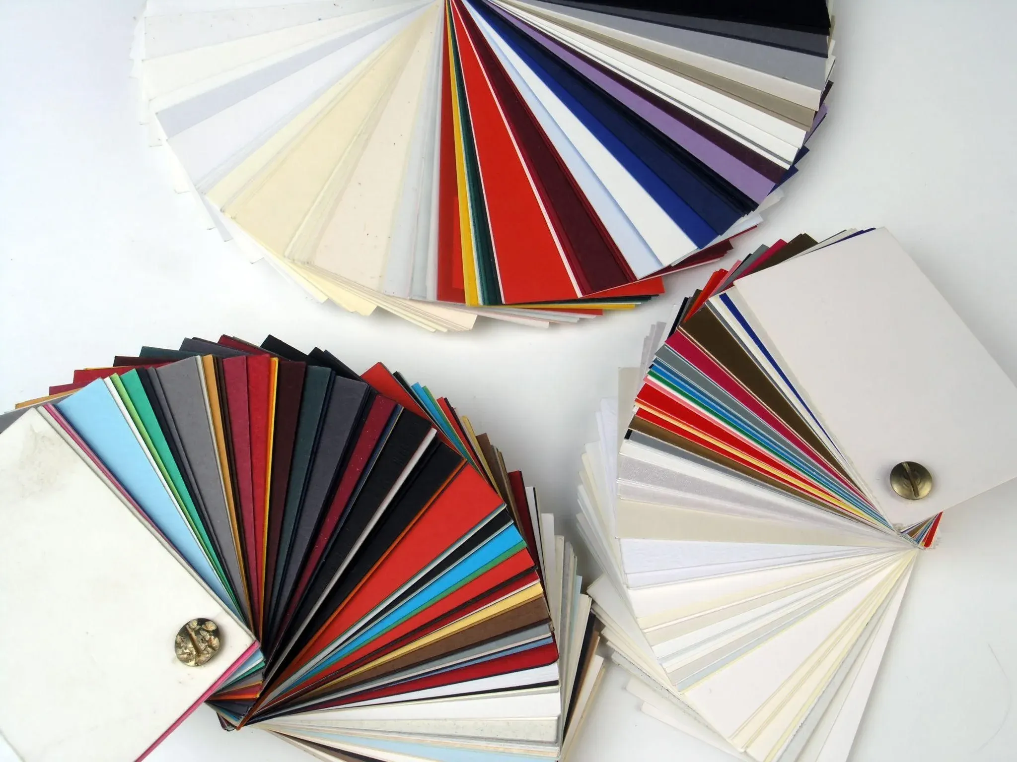
Honestly, the best way to choose is to see and feel both finishes with your own hands. Descriptions only go so far. When you hold a glossy card next to a matte card with the same design, the right choice usually becomes obvious in about three seconds.
At AlphaGraphics on Hillsborough, we keep paper samples on hand for exactly this reason. Walk in, tell us what you're working on, and we'll pull out the options so you can compare them side by side. No guesswork, no regrets.
We've helped Tampa businesses make these decisions for years, and we're always happy to share what we've learned.
Stop by our shop at 4410 W. Hillsborough Avenue, give us a call at (813) 736-9842, or reach out through our website. Whatever your next print project is, we'll make sure the finish does it justice.