Like most people, my family typically does a fair bit of travelling during the holidays. A few years ago, my brother and I passed some of the time on a 13-hour car trip by criticizing billboards along the highway. Maybe it was just because of the area we travel is mainly small-town mid-America, and not major metropolitan areas, but there are a lot of really terrible billboards out there. It made us think a little bit about what made some more effective than others.
It takes a different approach to design for large applications like billboards and signage than most print designers are used to. The rules are different – what works in one medium won’t work in another. Large scale mediums – like billboards, window and vehicle graphics, and outdoor signage – all need to function as attention grabbers. Most of the time your audience isn’t going to have time to read a lot of information on a sign that they’re passing by at speed. In fact, you have less than 5 seconds on average to get your message across. The idea should be to pique their interest enough to investigate further by visiting your website, coming into your location or prompting a phone call.

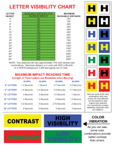
Take a look at the letter visibility chart for some more detailed information, including readability distance and effective color combinations. If you’re still struggling, take a look at some of our tips below, or contact us to help you with your outdoor signage needs!
- Use a clean, bold, easy-to-read typeface. Scripts and decorative fonts are generally difficult to read, especially if they are distressed, or have high-contrasting line widths. They may not be as attractive, but simpler fonts are usually more efficient.K
- Keep the environment in mind. A green sign on a green lawn isn’t going to stand out as well as a bright yellow or white sign will.
- Use high-impact photos with a simple focus. A busy image with too many focal points will just look like a jumbled mess. Make sure your photos are high-resolution, and if you’re placing text over the image, make sure the copy space doesn’t compete with the text.
- Don’t overcrowd or underwhelm your copy. Too much text will blend together like static on a tv screen. Too little and your message gets lost. Use large, concise messages that get your point across quickly, keeping your positive and negative space in balance.