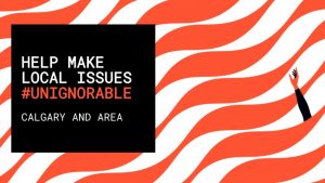
Is this the most unignorable color in the world? Pantone thinks so.
Orange has always been my least favorite color. Autumn is my favorite season, fall in Indiana means suddenly everything is orange. Pumpkins, fall foliage, Halloween decorations, candy corn, and construction. Four out of those five are things I love, so I'm not sure where my distaste for the color comes from.
Perhaps it's because it's actually been identified as the most obvious color in the world by Pantone in a new campaign with the United Way. The campaign is centered around a new standardized Pantone color that is literally named "Unignorable".
For its new campaign, Show Your Local Love, United Way wanted to make local issues – such as poverty, homelessness, domestic violence, mental health and social isolation – unignorable. So it partnered up with the Pantone Color Institute to develop a unique Pantone shade aimed at highlighting these issues in a way that's hard to overlook.

The result is Unignorable, a colour that's guaranteed to grab your attention. It's described by Laurie Pressman, VP at the Pantone Color Institute, as an instantly captivating, brightly coloured hue that radiates pure heat and energy. "The Unignorable colour boldly calls out for attention while remaining friendly, approachable and optimistic," she says. From Creative Bloq
I love everything about this. Not just because I love the idea of a color being identified as so obnoxiously loud that it literally cannot avoid being noticed, but that the application of said color is to highlight the needs of local communities and issues that cannot be set aside.
You know, I might not hate orange so much after all.