Tips and Tricks for Working with Color Digitally
I've started following a lot of illustrators on Twitter, who post a lot of fan art from movies and video games that I love. As someone who has only dabbled a little bit into digital illustration, I find it absolutely enthralling what people can do with a plastic pen and a drawing tablet.
Of course, digital illustration software has come a long way since MS Paint. Photoshop and other art/illustration programs such as Procreate and Clip Studio are incredibly robust in their tools, particularly when paired with a graphics tablet or touch-screen. Watercolor or oil paint brushes behave the way that the real medium would when mixed, with the added benefits of layers that can be hidden or locked to preserve details.
There are still hurdles to digital illustration though, because of the nature of the medium, especially if you plan on printing that illustration in the future. What you see on screen is never the same as what prints, due to the nature of RGB vs. CMYK color spectrums.
One of the illustrators I follow recently tweeted out a link to a Photoshop trick that I think is SUPER handy and important for anyone who uses Photoshop to create print pieces on a regular basis:
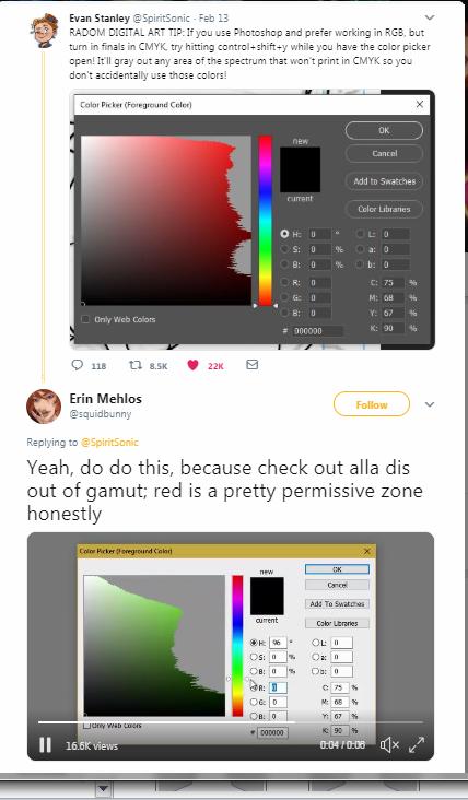
Check out the video in the reply, because it really shows you the scope of the difference in gamut.
While I haven't fully tested or tried this trick myself (I don't use Photoshop often enough!) I am thrilled to see artists educating each other on how to plan ahead for printing problems. It's a good thing to remember for anyone who works primarily in web or digital mediums!