As designers, we stare at our screens a lot. Regardless of what type of computer or software you use for designing, one of the biggest struggles that I'm sure everyone has is making sure that what you see on screen is indicative of the final result. With many of you working from home on a computer that might not be as optimized as your normal machines, or even a different operating system, it can be difficult to maintain consistency.
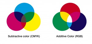
I've talked before about the difference between CMYK and RGB, which is often the reason why your monitor (which uses RGB light, or additive color) will show a different color result than the final printed product, which is generally produced in CMYK.
Creative Bloq is one of my go-to resources when I want reviews, tips and tricks regarding design software, hardware and programs. They regularly post reviews of computers, peripherals and accessories from a creative standpoint, which is super helpful if you're looking to update or add to your collections.
In February, they posted a series of articles around monitors and color calibration, including:
Of these articles, the first two are the most useful - the monitor calibration guide is a very practical step-by-step walkthrough to calibrating your monitor to a reasonable standard, both for Macs and Windows. The screen resolution guide is also pretty informative, and helpful for you to determine what size and scale of monitor will work best for your setup.
It's a simple thing to highlight, but can make a big difference to your workflow if you find yourself struggling to match colors!