Logos are losing their individuality and becoming generic, but is that bad?
Every few years the design world gets in an uproar about another business rebranding with a new logo that is, well... lackluster.
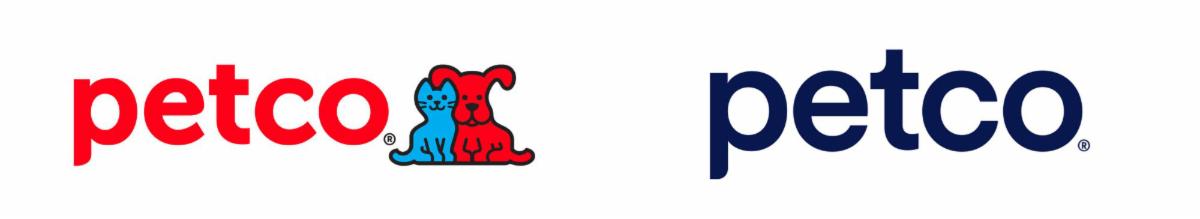
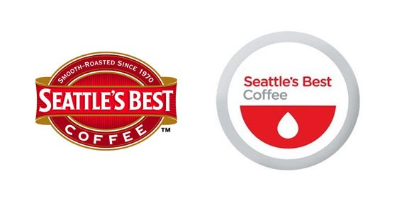
The Petco rebrand above is the latest in a long trend of abandoning custom typefaces and full color imagery for streamlined, gothic fonts and simplified graphics. These "modern" logos have caused quite a stir in the design community, with most lamenting the lack of originality and "boring" nature. For others (myself included) this is a welcome change. The updated logos are more legible, easier to use in more varied applications, and in the case of examples like the Seattle's Best logo below, means that it can be printed more cost effectively with products and packaging.
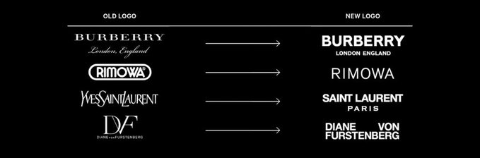
Creative Bloq, who recently posted an article about this trend and provided the examples shown above, highlights this last point as the "reason" behind the redesigns - namely, the dollars saved by switching from a full-color or difficult to print logo to something more simplistic.
It's hard to judge these redesigns on the logo alone, as many of them come with updated fonts, colors, presentation and brand guidelines that might still give a unique feel to the brand, even if the logo itself isn't as custom. But the simple truth is that between things like crowdsourcing and the wide availability of design technology, originality in logo design is hard to come by.
I suppose I count myself in the minority of designers who almost prefers the simpler, more streamlined logo looks - to a point. I do agree that there is a lack of originality in a lot of logo design, but I think there can be a balance of unique and still simplified, modern aesthetic logo design. A lot of consideration now is given to the applications that logos are used - print, web, on signage and vehicles, packaging and promotion - and the challenge is creating a recognizable and cohesive brand across all platforms. Simple and clean typefaces allow for a lot of utility, but I do miss the graphic element in the logo itself.
What are your thoughts on this boring logo design trend? Are you looking to rebrand your business, but want something a little bit more interesting? Our designers here at AG Carmel are always willing to work with you on logo ideas that meet all of your needs.